
Data Visualization: a (mental) breakdown on how we perceive data 1/5
At The Data Story we pay a lot of attention to how we present data as it is quite a challenge to communicate data effectively. Imagine you have found an extraordinary insight. To you as an analyst the conclusions are crystal clear from the data, but your team or the stakeholders just can’t seem to see it. This is, among other things, caused by how each individual thinks and processes new information. As an analyst you might miss a few steps in getting the message across, as you are familiar with data, logical thinking and your way of working is structured around coding, schema’s and data frames. To overcome these pitfalls we have a set of principles and tricks that we use or check before we finalize a visualization. We think that everyone from the management level to the delivery guy or maintenance service, each single person should be able to understand and work with data. One element that you should take into account is the way our brain defaults on how we perceive and process things. The advantage is that they are (mostly) the same with every person, so this can be widely used. In this and a few upcoming blogs we’ll cover a couple of these points. As a starting point we will look at Gestalt, which focuses on how we perceive patterns.
Gestalt
We as humans have an evolved brain. Although we have adapted to living with our brains that can make swift and balanced decisions (or at least we think we can), the defaults still date back to our “survival mode” that was set at the time we lived in the wild. This relates to how we perceive data as well. Instead of seeing individual points we are wired to see patterns and groups, this idea was extensively researched by Gestalt Psychologists in the beginning of the 20th centrury. They proposed a set of principle, the so-called “Gestalt Principles”, you can read more on them here.
The five we use the most, are:
- Closure
- Similarity
- Proximity
- Continuation
- Figure and Ground
These principles can work in favour of understanding a dashboard or againsrt it. In this blog we’ll explain how Closure can be a pitfall and how you can overcome it.
Closure – The theory
Closure means that our brain wants to translate the data we’re receiving to a “complete picture”. If something is incomplete, we’ll try to fill in the blanks (remind this specific wording!). Take a look at this picture:
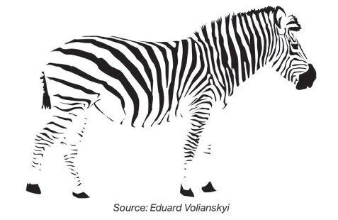
I bet you are seeing a Zebra, right? That’s funny because it is actually not a Zebra that is “closed”. Looking at it from a data perspective, it is just a bunch of black lines and figures that are not connected. The connection is made within our brain which creates the silhouette of a Zebra. This default from our brains comes in handy when we’re looking at how we lived in the wild. It enables a person to see something, and recognize it, without the need to see the complete picture. Would indeed be nice if you were able to spot a Lion from a distance when it was sneaking up on you and is only partially visible instead of seeing it the moment it jumped in the air and you’re a bit too late to start running.
So how is this an issue when visualizing data? Our mind is trying to close gaps, so we can see the bigger picture but it is therefore also prone to missing details that it actually filled in. In the example of the zebra: the silhouette of the zebra is missing. At first we didn’t see this, but once it was pointed out to us it became visible and you noticed it. This effect can cause issues in bar charts as we can show in an example.
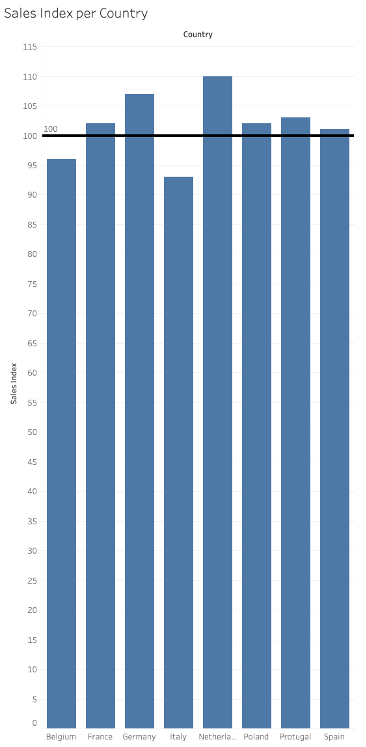
Visualization with closure
Let say you need to visualize the performance of different departments or regions. Most of them are performing well, but maybe one or two of them are falling behind. As many departments are good, we think that the general line, or the bigger picture, is good and try to see all lines as a part of that picture. Our mind finds closure and sees the bigger picture as “good”. So, when visualizing this data you should focus on the gap! Not only with words but also in the way you presented the data. Because if you didn’t, the audience was trying to look for closure and filtered the gap out of their image maybe even without knowing it. The funny thing is that when the brain finds closure, we seem to have a better memory of what we saw but only memorize it as a whole.
Take a look at this example and see how easy Italy and Belgium do mix up with the rest of the regions that are actually doing good.
So, the next time you’re presenting your findings and you need to make your audience aware of what we should focus on, you should check the following:
- Is it understandable for every single person why a gap in the picture simply busts the total outline and have you made sure that the gap stands out? Because as we saw with the zebra and in the example, apparently we can get closure even when the picture isn’t closed.
Take a look at the example below to get an idea of the possibilities.
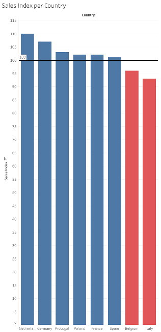
We have made sure that the bars that are short a few points, are signaling that something is wrong. The color red indicates to us that something is wrong. This is one way of signaling the gap. Another one is to sort them in a way that we can see that there is something wrong on the right side of the axis. It draws our attention to that side. Maybe you should even circle it in your presentation to draw even more attention towards it, depending on your audience. It’s now further up to us to define what’s actually creating that gap and point out that we should fix it so we can fix the bigger picture. By the way, the fact that we all know that red signals something bad or why our attention is drawn to the right side by filtering, can also be traced back to Gestalt Principles. We’ll cover those aspects in upcoming blogs!


