Data Visualization: a (mental) breakdown on how we perceive data 2/5
In our last blog we described the importance of drawing attention to the right aspects of your visualization and how findings can end up invisible in a presentation. The principles we use to explain how we perceive data and how our brains try to immediately find patterns are called Gestalt Principles.
You can read more on Gestalt principles via the link here.
The five we use the most, are:
- Closure
- Similarity
- Proximity
- Continuation
- Figure and Ground
Next on the list is Similarity. This is a great example on how we process the deeper visual aspects of data and also dates back to the time when we lived in the wild. Back then we had to rely on the fast default responses our brain could make based on the information it perceived.
“The law of similarity states that elements within an assortment of objects are perceptually grouped together if they are similar to each other. This similarity can occur in the form of shape, colour, shading or other qualities.
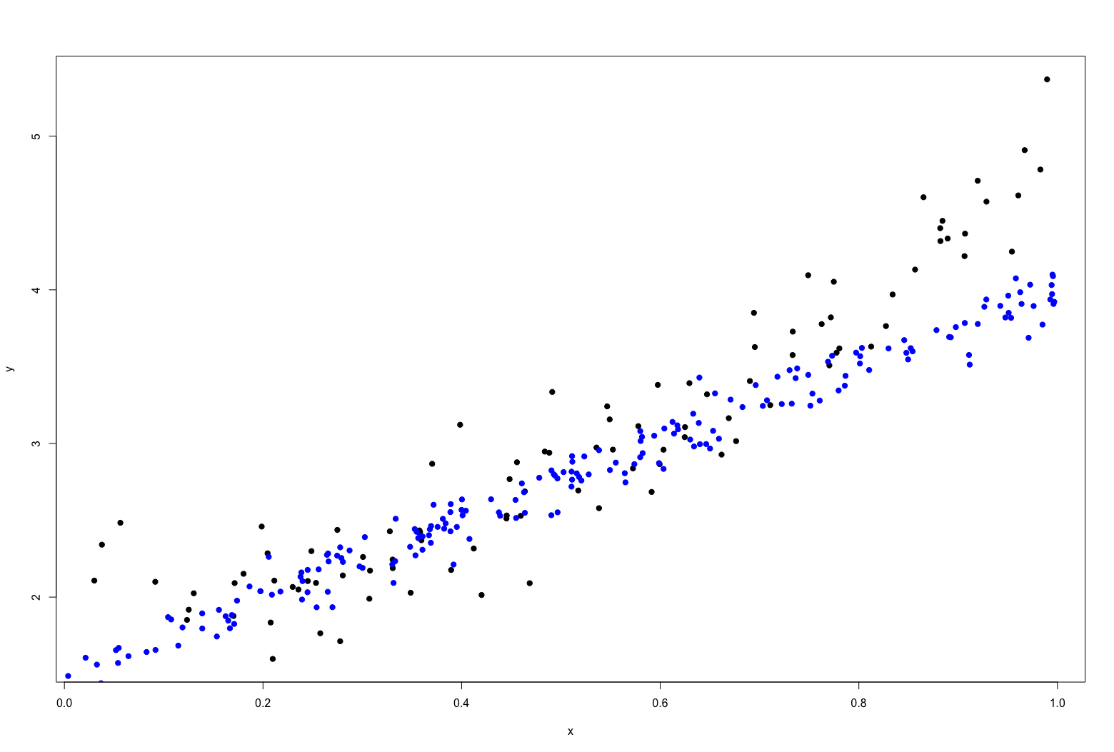
So why is this important in data visualization? By using similar colors, shapes or combinations of those clear groups can be created. As an example look at the randomly generated scatterplot below:

It looks like a general set of datapoints (with perhaps a linear relation between x and y). If the same graph is changed by making some dots blue, suddenly you will perceive two groups. Although a simple example I am always amazed by how strong it is, meaning how fast a groups is perceived.
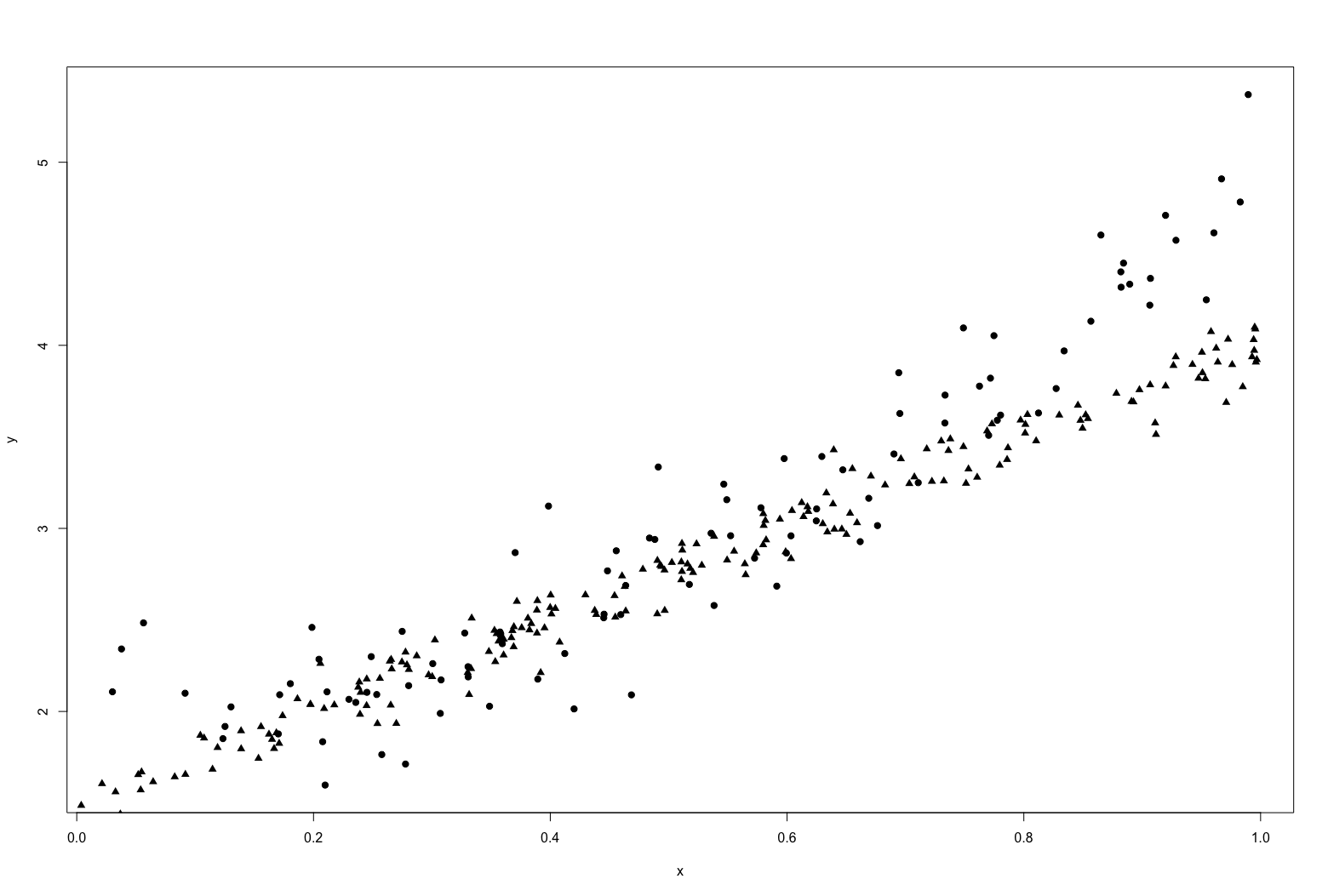
The choice of attribute to use is important though. The more different the attributes are between the two groups the stronger the effect will be. For example below the groups are identified by the shape. Suddenly it is way more difficult to see the two groups.
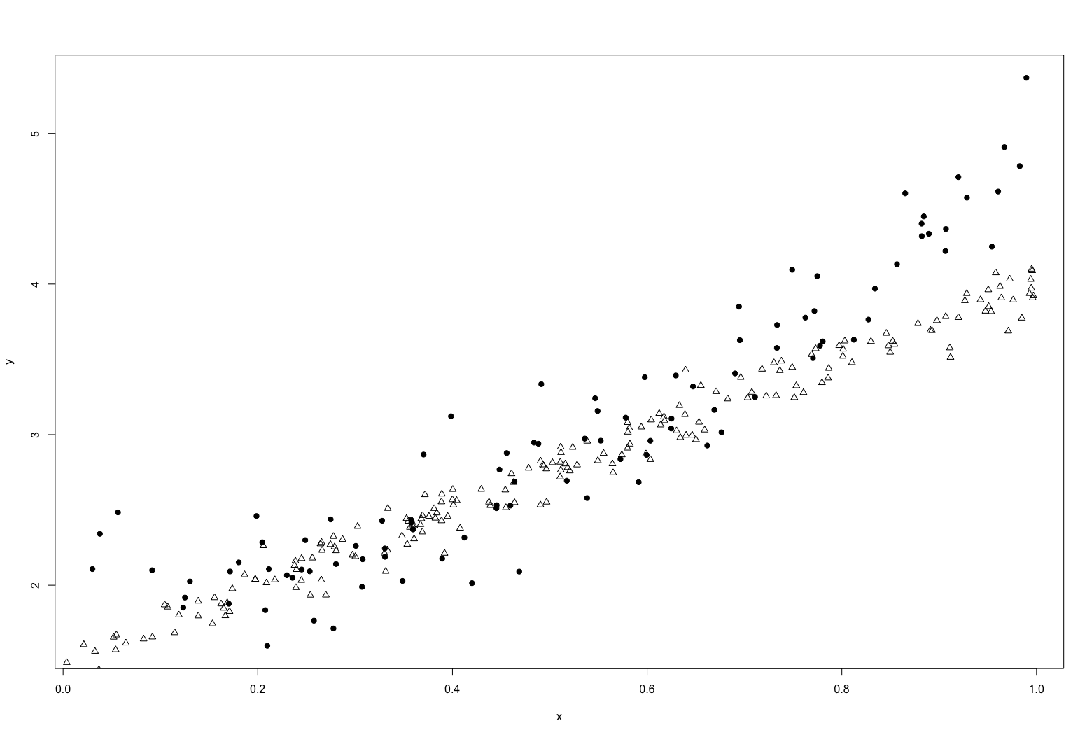
But if we change the shape and the fill color of the shape, suddenly it is visible again:
In practice
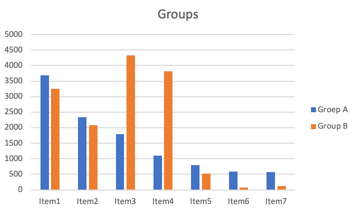
Luckily often data visualization tools, like Tableau, Data Studio and even Excel will do this automatically. Below a simple bar chart with items in 2 groups. The bar charts for each item are closer together, which is an aspect of Gestalt’s Proximity, and the colors for Group A and Group B are such that they are also visually grouped.
Summary
Our brains group different points together when we perceive them as similar. The human eye tries to built a relationship between elements that appear to be similar. The reason to define something as similar can be found in all visual aspects but the most important ones are color, shape and style. This can be of high importance for data visualization. A group of datapoints or different results in a graph may not make total sense when the groups are not clear. Whenever you need something within a set to stand out of differentiate from the rest, keep an eye on the visual traits of the different groups. Make sure that it is clear what grouping and segments should be visible, therefore are visually different and not similar, and that it is aligned with the visual traits such as color and shape. Remember that like in the example, similarity can be of different aspects such as color or shape but one might be better visible than the other.


