Need to know what is going on?
The world has changed a lot and so did most online businesses. Therefore we thought it would come in handy to have an overview of your site’s activities and settings to see what is going on. It is time for a new blog post that contains a template for Google Data Studio that you can use in minutes! We know that Google offers some out of the box templates but to us those were way to complex and crowded with visuals. Therefore we thought, let’s make an easy to use overview.
Google Analytics can be seen as a buffet. There is a wide variety of choices you can make as long as they are on display. Wouldn’t it be great if you could rather use the raw ingredients and materials instead and make something out of it? With Google Data Studio you can! Google Analytics 360 or any other pixel that gathers data on hit-level gives you the most in depth views but even with the free GA version you’re getting a lot of perspective. See for example our previous blog here on how to spot trends by using 360 hit-level data. Now that everything is changing, you might find some interesting aspects in the trend report as well! If you’re not using a Google 360 license but the free version, you have some possibilities as well.
The Dashboard
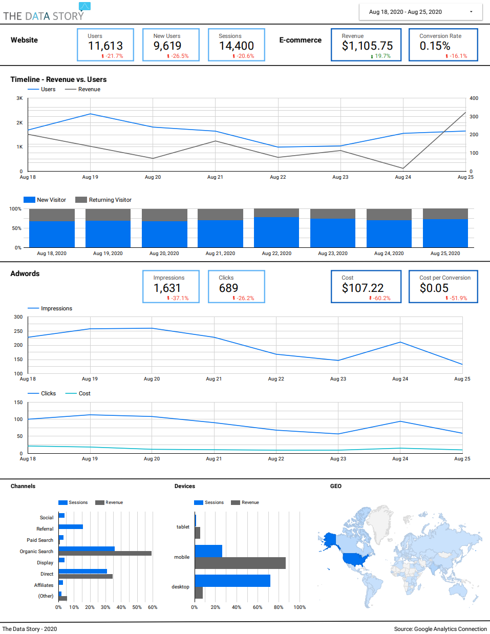
A useful dashboard provides you with insights right away, creates a storyline and enables you to spot the details easily. To do that at The Data Story we use a set of design principles and guidelines to make sure our dashboards are easy to read and intuitive to work with. Some of those will be explained in detail in later blogposts and a complete training is on its way to go live. For now, take a look at the example below. The dashboard displays the most important metrics at the top, shows you how they were evolving over the past period and indicates what contributions were made from the most important aspects of your website’s setup. This dashboard enables you to have these insights at just one glance. No need to scroll through multiple pages, change parameters all the time or switch tabs to compare. It is there in the right order and visual setup. Once you have spotted what is most important, you can dig deeper in GA itself or even start a complete analysis with your data sources.

How to read?
We don’t expect the most sophisticated web shops to start using this dashboard but do think that for everyone out there with a web shop that is not run by a complete data- and development team that it will give insight in what’s going on. So how do you read this then? First of all, you can see how the main metrics are evolving, for example the traffic and conversions on the site and the advertisement spending. Since it is all lined up, you will be able to spot trends. For example, does an increase in marketing spending correlate with more visitors or revenue? Next to that, you can spot focus areas. In the example above, the lowest part of the dashboards tells something about the origin of traffic. One noteworthy insight is that traffic comes mostly from desktop. However, revenue comes mostly from mobile. Therefore it would be wise to put some extra effort in a smooth mobile checkout or start ana analysis if there is a trend in research via desktop and buy via mobile behavior that you can use in your advertisement settings.
Please feel free to use! The link to the dash is right here and you can easily copy the template and connect it with your own Google Anlytics account. Like what you’re seeing? Stay in touch with us via our site and Linkedin page since we will be giving more tips, templates and codes soon. Next to that, a complete course to create dashboards like these will be scheduled in the near future!


