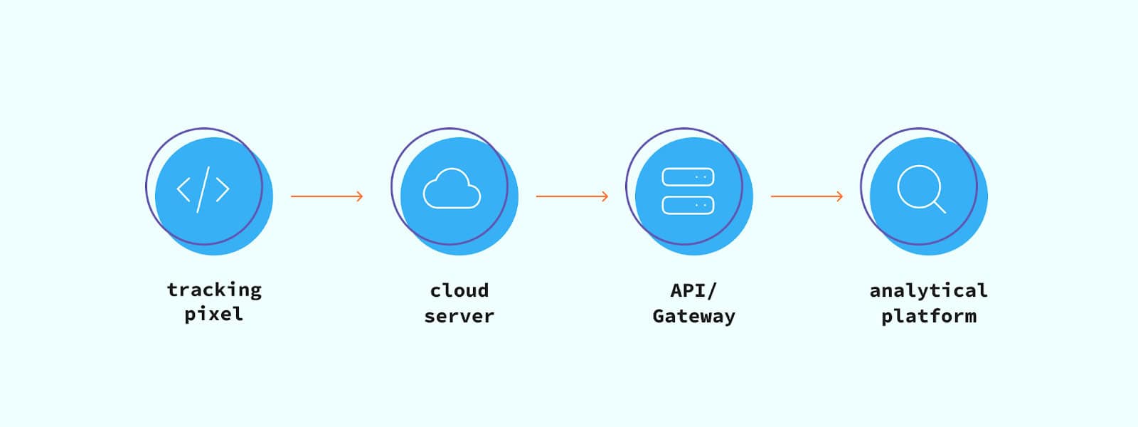
Once we know a user’s interests, it is much easier to target them personally, likely also more effectively. With this goal in mind we made an attempt to cluster users based on the categories of their interactions with content using Principal Component Analysis (PCA). In this blogpost we will guide you through a Jupyter Notebook. Check out our GitHub repository to follow along or try it for yourself! The code is split up into five segments:
- Data collection
- Data preparation (feature scaling)
- Choosing a number of components for PCA
- Performing PCA and visualising it
- Assigning each user to a cluster
We will shortly get into the specifics of PCA but, before we do so, let’s first look at some use case examples for the clustering we are going to discuss. Let’s say you run a blog and you assign categories to each article you write. Or imagine you have a webshop in which all products belong to categories. It would be interesting to find if there are any patterns in user interest. If a noteworthy number of users interested in category A is also interested in category D, we can recommend category D to users that have only interacted with category A and vice versa.

Clustering in Machine Learning – Principal Component Analysis
When we don’t know a whole lot about data yet, we can use a Machine Learning technique called Clustering to learn more about it. Just as books and music have genres, we can group unlabelled data points into clusters that we might understand more easily. So-called clustering algorithms have different methods, but all have one thing in common: their aim is to maximise similarity between data points, forming groups with maximum similarity. There are different ways to measure similarity, such as the distance between two points. In a two-dimensional plot, for instance, two points with small distance have great similarity.
Too many ingredients in a recipe makes it a lot more difficult to follow. The same goes for clustering algorithms. Once the number of dimensions increases, it becomes increasingly complex to measure similarity and thus harder to perform clustering. To illustrate this, imagine drawing a line of best fit in two dimensions: fairly doable. Now imagine trying to do so in three dimensions: harder but still doable. Keep increasing the number of dimensions and you understand the point. To combat this there are techniques to reduce the number of dimensions, often used prior to clustering algorithms like K-Means to make them more effective.
One of these techniques is PCA. In PCA, principal components are constructed: linear combinations of the initial variables. The point of these components is that they are uncorrelated and contain most of the information from the initial variables. PCA tries to put as much of the information into the first component, as much of the remaining information into the second and so forth. More specifically, it tries to represent all data vectors as a linear combination of eigenvectors, minimising the mean-squared error. To learn more about the mathematics behind PCA, take a look at the Wikipedia page.
Collecting and preparing our data for PCA
As shown below, our input table should have all users in rows and columns for each category. Its values should indicate how many times a user has interacted with a category. In the Jupyter Notebook you will find that you can either import this table from BigQuery or from a .csv file. To learn more about necessary credentials for importing through BigQuery, read the following article in the BigQuery docs. Once you have created a Dataframe, we can start our preparation.

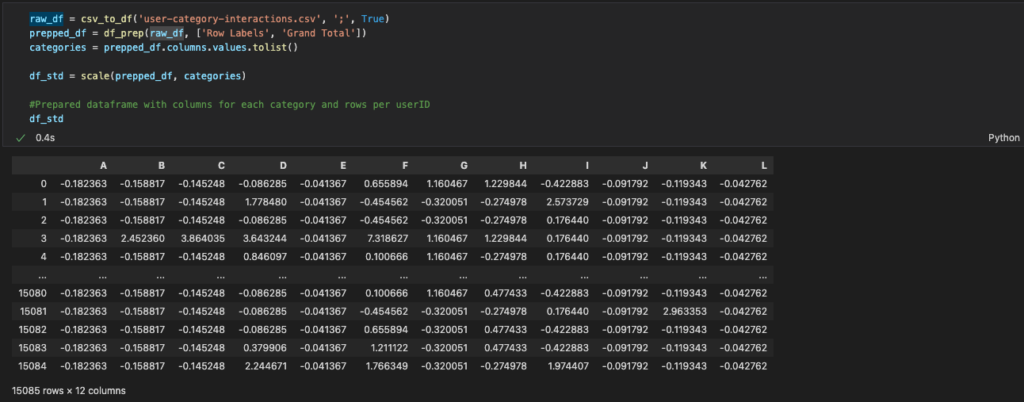
First, we will clean up the imported DataFrame using the methods in the Jupyter Notebook. We then perform feature scaling, also known as data normalisation. PCA, amongst many other machine learning algorithms, is very sensitive to outliers: if there is a point with an exceptional distance from the other points, the result will be dominated by this point, likely giving misleading results. Therefore, we normalise the range of all features to make sure they each contribute more proportionately to the final distance. To learn more about feature scaling, take a look at the Wikipedia page. The code and result of this preparation is shown below.
PCA
We now finally have our ‘mise en place’ ready and can get cooking. Let’s turn on the stove and start PCA. We first need to find out how hot the stove should be. What number of components do we want to reduce our dimensions to? This number should be as small as possible, while keeping in mind that we should maintain sufficient information from our original data. We don’t want too many ingredients when cooking so we skip some, but we do want to keep as much of the original taste as possible. To do this, we calculate the explained variance for each component. In simple terms, the explained variance tells us how much of our data is represented by a component.
Opinions differ across the board and it depends on your data, but good practice is to keep at least around 80% of your variance. We plot the explained variance per component as shown below and as you can see, we need at least 6 components to keep 80% of our variance. As the number of components gets higher, you can see that each additional component contributes less to the total variance. The difference in variance indicates how significant a component is.

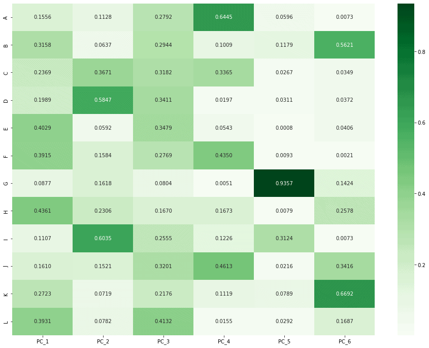
Now that we have chosen to perform PCA with 6 components, we can run our function. After doing so, we can plot a heatmap to visualise each component. The darker a cell, the more significantly its category is represented in that component. We can now see what links there are between categories. As principal component 2 below shows, someone interested in category D is likely also interested in category I.

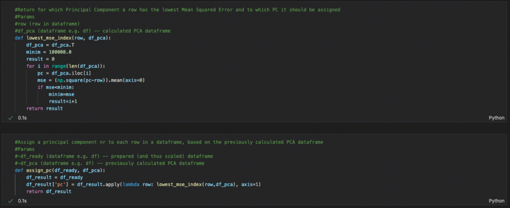
Now that we have our principal components, we can assign each user to a component and, by doing so, cluster them. To do this, we calculate the Mean Squared Error (MSE) between each component and the row of user interactions and find the component with the lowest MSE, the row that is most similar. We do want to find the spread of our users over these clusters to see whether the result is even at all useful.
What’s next?
Now that we have segmented our audience, we can target them more personally and start questioning where to go from here. Which user group is the most active? Which user group has the best conversion rate? Is the content consumed by this group better? What user group should we focus on?
Follow The Data Story on LinkedIn to stay up to date on our blogs!
