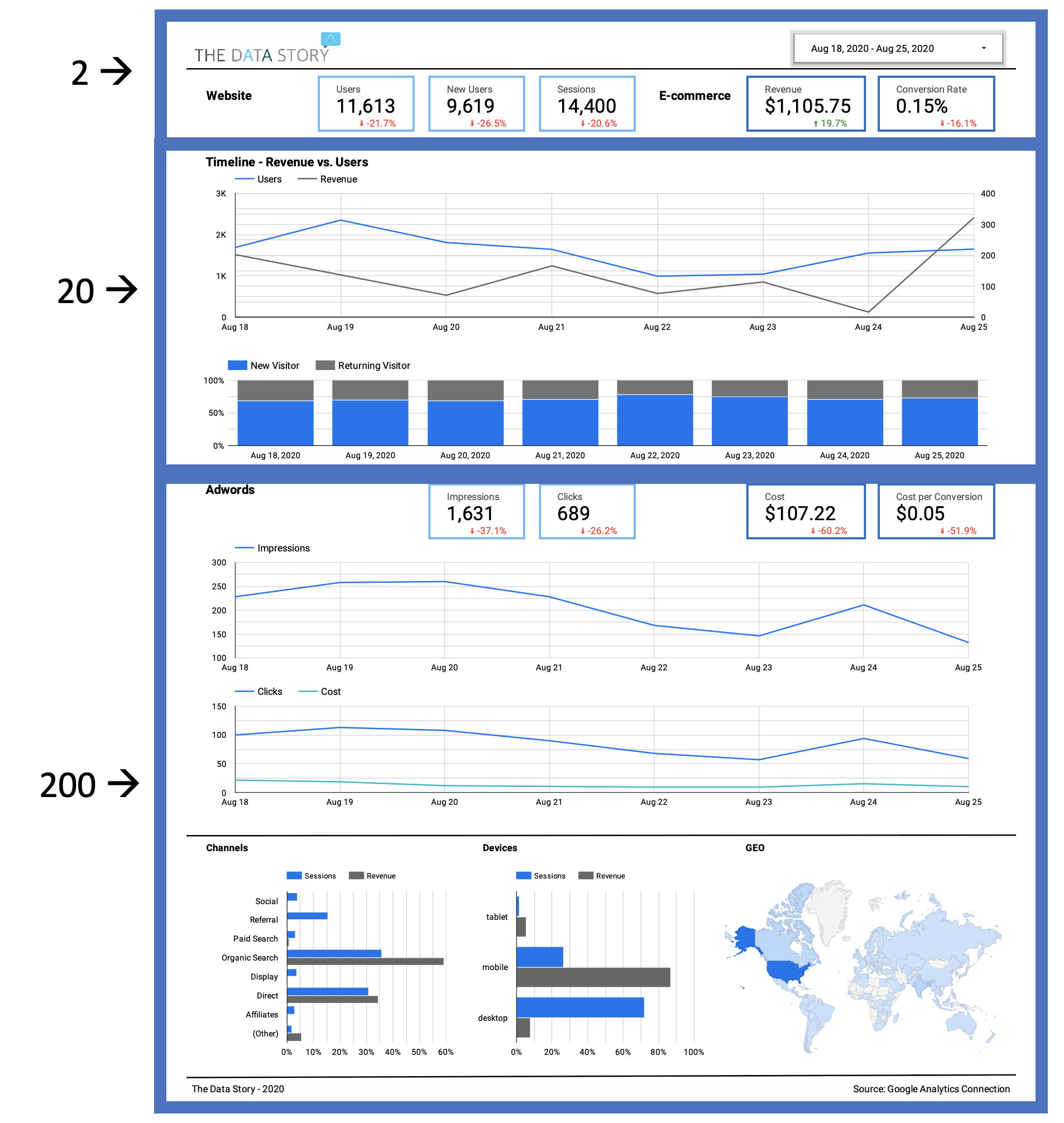
The 2-20-200 dashboard rule: a perfect storyline for your dashboard
This blog will be a short one. We’re currently highlighting a lot of the techniques and tricks we’re using to make our dashboards user friendly and effective in sending a message across. One of them is the 2-20-200 rule, and it’s a simple but important one.
The “rule”
On its’ own the rule is quite simple. A dashboard we’ve created should, when looking at it, only cost you 2 seconds to see the overall situation which usually translates to the main KPI’s. Secondly, it should only take you 20 seconds to find out how the KPI’s are progressing and what the change or possible outlook is. Lastly, you would need 200 seconds maximum to find out what the splits and built up of those KPI’s are to spot main points of interest that explain why a certain KPI is doing better or worse than you would like.
Put to Practice
Though it sounds simple, it usually is not. On the one hand you’re trying to fit in everything you can and on the other all the data might not support your goal of sending a clear message. Although it might be tempting to put as many data in the dashboard, it will most often not support the readability of it. The 2-20-200 rule can help you in this. Because of the set time limits it will guide you on:
- Design
- Composition
- Content
The design should be in a way that you easily flow through the aspects of 2-20-200. Since you only want 2 seconds to be spend on the main KPI’s they should be clearly visible and on top. Obviously, the next thing is the progress of that KPI’s, and some comparisons maybe, but not too much beyond that. The perfect place is ust below the top, and it will be only a few visuals since it should fit within the 20 seconds time window. At last, it becomes more open for own preferences or input since you can show quite a lot of splits for the 200 seconds part. The last part can even be a new page or an appendix.
Once you know what data to put where, you need to think of what kind of visualizations will be in there. The 2-20-200 rule helps you in this as well. Since you know that the 2 second rule applies to the main KPI’s, not a lot on visual editing should be done there. In 99% of the cases just a box with a printed number is best suitable. Also, for the second section you want to see some progress or comparison but since you’re limited to 20 seconds the complexity should also be limited. Line charts and bar charts or variants on those work best for this. There is no need to make very sophisticated visualizations nor do we need too many splits or data points in the visual. Those will come at the end where you can further drill down on the numbers.
Lastly the content of the visualizations is important. As you can see, by using the rule we’re already building up a story line. It’s starting with the main numbers, telling how those have become the way they are and in the end showing all the details. This storyline also helps you to identify what should be in the dashboard and what not. Since you have set a time limit for each section, you’re also limited in what you can show. Therefore, the main question is: does it support the storyline of the KPI’s and is everything that I selected to support this storyline going to fit in the set time limits? If the answer is “yes” to both, then you have the perfect input for a user friendly and understandable dashboard. If not, you should start eliminating some input by evaluating what actually helps for explaining the main KPI’s.
See the example below, which is from our basic webshop report you can find here.
Now you know how we design and fill our dashboards, we hope that you can make good use of the “2-20-200 rule” for one of your own dashboards!